Symbol of a superhero empire: The evolution of Marvel’s logo

Symbol of a superhero empire: The evolution of Marvel’s logo
Marvel, a name that resonates with thrilling superhero sagas and cinematic brilliance—though some may disagree about the latter, given the mixed reception of “The Marvels” this past fall—has undergone a remarkable evolution, not only in its storytelling but also in its iconic logo.
Conceived for one of the world’s most beloved comic brands, Marvel’s iconic red and white logo showcases the ability of a unique logo to define and symbolize the ethos of a publishing empire. However, like many other enduring logos, it has evolved significantly over the company’s decades-long history. Each iteration is a reflection of the cultural and design shifts of its respective era.
Marvel’s brand has its origins in 1939 when the company’s precursor, Timely Comics, which rebranded as Atlas Comics in 1951, was founded by pulp magazine publisher Martin Goodman. The company’s first comic book, Marvel Comics No. 1, was published in October 1939. The issue featured superheroes destined for stardom, including the Sub-Mariner and Human Torch. Many more characters were introduced during the 1940s and 50s like Captain America, paving the way for the Marvel Universe as it is known today.
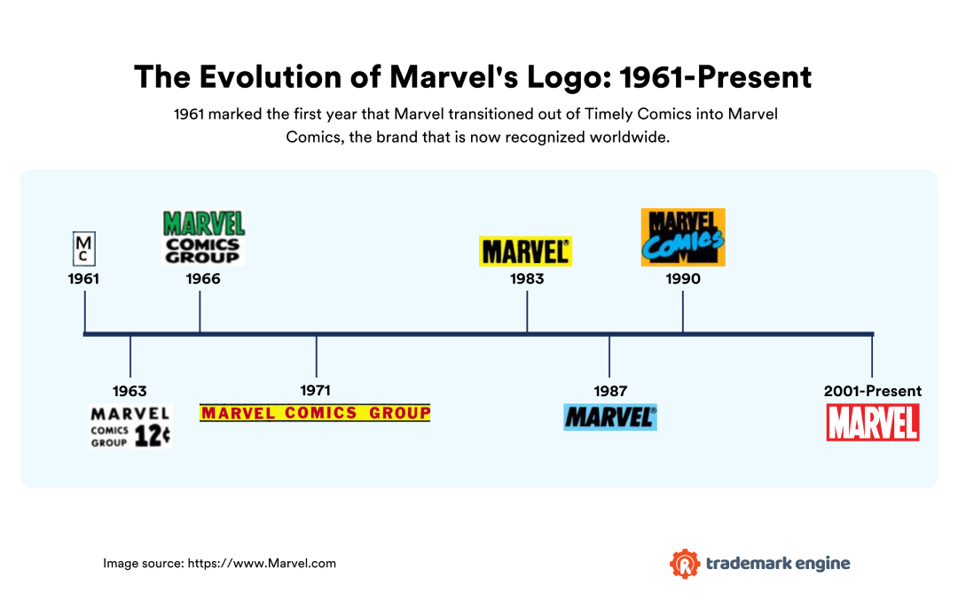
Trademark Engine, a trademark filing service, traced the history of Marvel’s logo, from the company’s rebrand as Marvel Comics in 1961 through the present. Read on to learn about the evolution of Marvel’s logo design, including strategic and historical points when the company trademarked its evolving logo and its uses.
![]()

The evolution of Marvel’s logo: 1961-present
1961-1963: “MC”
The original Marvel logo opted for simplicity, consisting merely of an M placed vertically over a C. The two letters were quite small and appeared in a tiny box on the front cover. In fact, it was somewhat overshadowed by other elements on the cover, including the Comics Code Authority seal placed just above. This logo graced comics containing popular characters created during this time, including Ant-Man in 1962, and Iron Man and X-Men in 1963.
The logo first appeared in July 1961 on the covers of comics such as Strange Tales, Volume 1, Issue 86, and Tales of Suspense, Volume 1, Issue 19.
1963-1966: Marvel Comics Group
In the mid-1960s, Marvel Comics surged in popularity with the introduction of characters such as The Avengers and Doctor Strange. Unveiled in May 1963, less than two years after the “MC” logo, Marvel’s new logo was the first of many to feature the company’s full name, with “Marvel” in a larger, bold font on a separate line for enhanced visibility. Overall an improvement from the first, this logo was much more prominent than the first and likely helped to promote brand recognition among comic book readers.
The updated logo made its first appearance on the covers of classic comic book covers, including Tales of Suspense, Volume 1, Issue 41 and Journey Into Mystery, Volume 1, Issue 92.
1966-1971: Marvel Comics Group
Marvel introduced another update to its logo about three years later, aiming for greater impact and visibility. This logo first appeared in March 1966 in issues such as The Amazing Spider-Man, Volume 1, Issue 34. The redesign was released just in time for the introduction of the comic book company’s namesake hero Captain Marvel in 1967, as well as other characters, such as Ultron in 1968.
This logo was a marked improvement from its immediate predecessor. The price was moved to a different place on the cover, and the logo’s font became bolder and larger, with “Marvel” presented in a different typeface and color from the rest of the text, creating a striking contrast. “Marvel” appeared in different colors, depending on the comic book issue, including green, red, and purple. The text was also centered to create balance. Marvel’s 1966 logo heralded the debut of the bold, tall, and angular letters that would eventually define the Marvel brand.
1969: Marvel trademarks its logo
In 1967, Marvel filed a trademark for its logo with the United States Patent and Trademark Office (USPTO). The trademark was officially registered in June 1969. As a standard character mark, this trademark safeguarded the specific letters and words of the logo, granting Marvel the flexibility to alter its color, size, or font, all while maintaining legal protection for its use.
This first trademark extended the use of the logo to various print materials, including comic books, magazines, pamphlets, newsletters, and paperbacks. It allowed Marvel not only to effectively prevent unauthorized usage and protect the brand’s goodwill, but it also enabled the company to take legal action against any infringement.
1971-1983: Marvel Comics Group banner
In 1971, Marvel unveiled a redesigned logo, now featured as a banner placed at the top of all its comic books. This iteration was much larger and more eye-catching, and, in a substantial departure from the previous two logos, showcased the entire brand name in bold and all-caps rather than directing the visual emphasis towards “Marvel.” Like the word “Marvel” in the company’s previous logo iteration, this one also frequently appeared in a wide range of colors, depending on the color scheme of the comic book it was on.
Making its debut in November 1971 on titles like Thor, Volume 1, Issue 193, this logo remained unchanged throughout the 1970s and into the early 80s. It was a witness to significant character introductions, including The Eternals in 1976 and Ms. Marvel in 1977, and marked an era of creative expansion in Marvel’s story universe.
1983-1987: Marvel
In 1983, Marvel unveiled a bold new logo, featuring just one word — “Marvel,” a notable shift from the previous “Marvel Comics Group” logo. This new design featured a bold, slimmer font with reduced letter spacing, creating a cleaner, simpler, and ultimately more contemporary look.
This new logo was a brief hiatus from the era of multicolor fonts and backgrounds used from the mid-1960s through the 70s. Appearing predominantly in black and white, this new logo debuted in October 1983, appearing for the first time in comic book covers such as The Amazing Spider-Man, Volume 1, Issue 245.
1987-1990: Marvel italicized
In April 1987, Marvel made a subtle update to its logo, italicizing its letters and decreasing the space between them. This adjustment retained much of the look and feel of the previous version, yet with added energy and movement. The wider, angular font added a solidity that the former logo lacked, and the italics imparted excitement, evoking energy and speed. As with Marvel’s previous logo iteration, this also appeared only in black or white. This logo first appeared in comics including The Incredible Hulk, Volume 1, Issue 330.
1990-2001: Marvel Comics
The logo that Marvel released in 1990 was a daring departure from the previous two versions. For the first time, it showcased just two words – Marvel Comics – each in a distinct font, superimposed on a heavy black “M.” While Marvel retained the spirit of the brand’s 1983 logo, the addition of “Comics” brought a playful touch, with its marker-like, whimsical font.”
This design also stands out in part because of the heavy black M behind “Marvel Comics,” which was reminiscent of MTV’s logo at the time. As with Marvel’s logos of the late 1960s through the early ’80s, the Marvel Comics logo appeared in many different colors depending on the color scheme of a given comic book cover. However, the M and “Marvel” predominantly appear in red, foreshadowing the logo’s current red appearance.
This logo first appeared in comics published in February and March of 1990, including Uncanny X-Men, Volume 1, Issue 258, or The Amazing Spider-Man, Volume 1, Issue 330.
1991: Marvel trademarks the design of its logo
In 1991, Marvel further strengthened its brand protection by applying for a design mark trademark. Unlike a standard character mark, which protects the text of a logo irrespective of font style or design, a design mark specifically protects the logo’s visual graphic elements.
Registered with the USPTO in 1992, this design mark was applicable to a range of written publications, including comic books, illustrated magazines, and trading cards. In 1994, Marvel further extended this protection, filing for the same design’s use in pre-recorded video tapes and discs, covering live-action and animated cartoons.
2001-present: Marvel
In 2001, Marvel unveiled what would become its longest-running logo to date. Featuring the word “Marvel” in large, bold, uppercase letters, it is a true embodiment of the brand and its history. Its font is a nod to Marvel’s 1983 and 1990 logo iterations, but its vibrant red color, emblematic of the brand, evokes the power and passion of the ultimate hero. This bright color is also associated with action, intensity, adventure, and excitement.
Marvel’s current logo made its initial appearance in September 2001 but became fully integrated into the brand’s identity in 2002. Its debut in Marvel’s comic book line occurred in 2002, and it graced the cover of The Amazing Spider-Man, Volume 2, Issue 45 in September of that year.
This logo has since become a lasting symbol for Marvel Comics, remaining in use even after the company’s acquisition by Disney. It has witnessed the introduction of a wide variety of newer characters and storylines in the Marvel cinematic universe, including “Thor: The Dark World” in 2013, “Avengers: Endgame” in 2019, and “Black Panther: Wakanda Forever” in 2022.
2008: Marvel trademarks its logo once more
In 2008, Marvel applied for a standard character trademark for its logo. This type of trademark doesn’t lay claim to any specific font, style, size, or color, allowing Marvel flexibility for any future design modifications. This trademark enhanced Marvel’s ability to advertise and promote various goods and services linked to its comic book characters through partnerships with other brands. It was officially registered with the USPTO in 2009, though the application cites 1991 as the year of first use.
Opening doors for licensing and partnerships, this trademark highlights Marvel’s incredible growth and enduring status as one of the most beloved comic book brands in history.
This story was produced by Trademark Engine and reviewed and distributed by Stacker Media.
Provided by Stacker


